

In today’s digital age, the internet is accessible from a multitude of devices, ranging from smartphones and tablets to desktop computers and even smart TVs.
As a web developer, it’s your responsibility to ensure that the websites you create are not only visually appealing but also functional on all screen sizes.
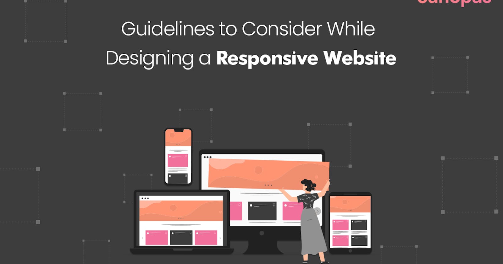
This is where responsive web design comes into play. It is important because it ensures that users have a consistent experience no matter what device they are using.
What is a Responsive Web Design?
Responsive web design is an approach that aims to make web pages render well on different devices and window or screen sizes.
The primary goal is to ensure that users have a consistent and user-friendly experience regardless of the device they are using to access a website.
Table Of Contents
Understanding Responsive Web Design
Mobile-First Approach
Viewport and Media Queries
Flexible Grid Systems
Images and Media for Different Devices
Responsive Typography
Testing and Debugging
Frameworks and Tools
Performance and Page Speed
Closing Thoughts
In this blog, You’ll explore the concept of responsive web design and discuss best practices for building websites that adapt seamlessly to various devices and screen resolutions.
So, fasten your seat belts and get ready to embark on a journey of designing a responsive website by visiting to Canopas Blog.
Follow Canopas for our latest technical blog posts!